The food industry is a $5.32 trillion dollar business. The alluring profitability of the food business along with increasing competition has inspired a new discipline: menu engineering. As the name suggests, it is a deliberate construction of menus to generate greater profits per customer.
When asked about the rise of menu engineering, value perception expert and author of Priceless: The Myth of Fair Value William Poundstone explains that it is driven by our mental instinct to look for shortcuts: “Almost anyone in the marketplace today has too much information and not enough time to decide.”
And menu engineers – masters of misdirection, as Poundstone calls them – offer just the right kind of shortcuts our brains crave for. For SaaS marketers who rack their brains trying to figure out a way to increase customer lifetime value (LTV), there is a lot to be borrowed from menu engineering to increase SaaS profitability.
And the best part? You don't need to tweak your product to achieve a breakthrough in your revenue. Treat your pricing page like a menu, and optimize for profitability like a pro.
Shoot For the Stars
Before you roll up your sleeves to revamp your pricing page, do the homework and segment your products by sales volume and profitability first.
Is your most pricey product the one you should sell the most? Not necessarily. According prominent menu engineer Gregg Rapp, two criteria decide the importance of a dish: profit and popularity. Profit is calculated by subtracting cost from price, while popularity is indicated by numbers of the items sold.
Once you've mapped out the profit and popularity of all your products, categorize them into what the menu engineering industry calls the matrix of “plow horses, stars, dogs and puzzles”.
Stars are the most popular and profitable, while dogs are the least popular and least profitable ones. Plow-horses are popular but low in profit (salad and soups, for instance), and puzzles are highly profitable items that need investigation on why they aren't more popular.
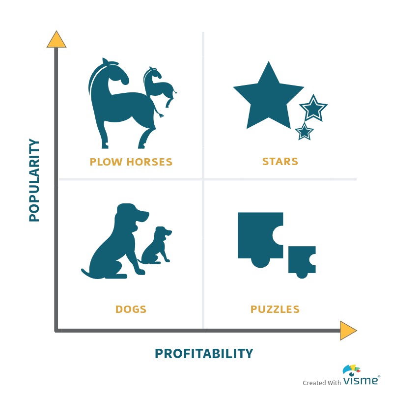
Obviously, we should first of all shoot for the stars: highlight the star items on your menu, at the same time unleash the star power in your “puzzles” and “plow-horses”.
Engineered For Success
When it comes down the designing the menu that brings in roaring sales, below are some strategies menu engineers have used that SaaS marketers can learn from.
Reduce “pain of paying” by removing dollar signs in prices
Research done at Cornell University (Dr. Kimes et al.) found that customers spent significantly more when prices were displayed in numerals without dollar signs. The sight of dollar sign reminds consumers that they're spending money, says restaurant consultant Aaron Allen, so they started getting rid of it and using numbers only.
In addition to using dollar signs and even spelling out the word “dollar”, other common mistakes by restaurateurs include putting dotted leader lines between the food item and price, and grouping prices in a column.
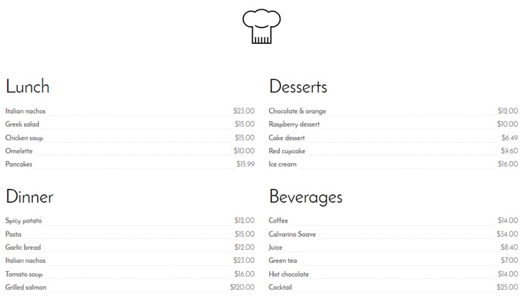
These practices draw diners' attention away from the food and focus on the price, according to Rapp. One solution is “nested pricing”, where the price (in numerals without dollar sign of course) comes right after the description.
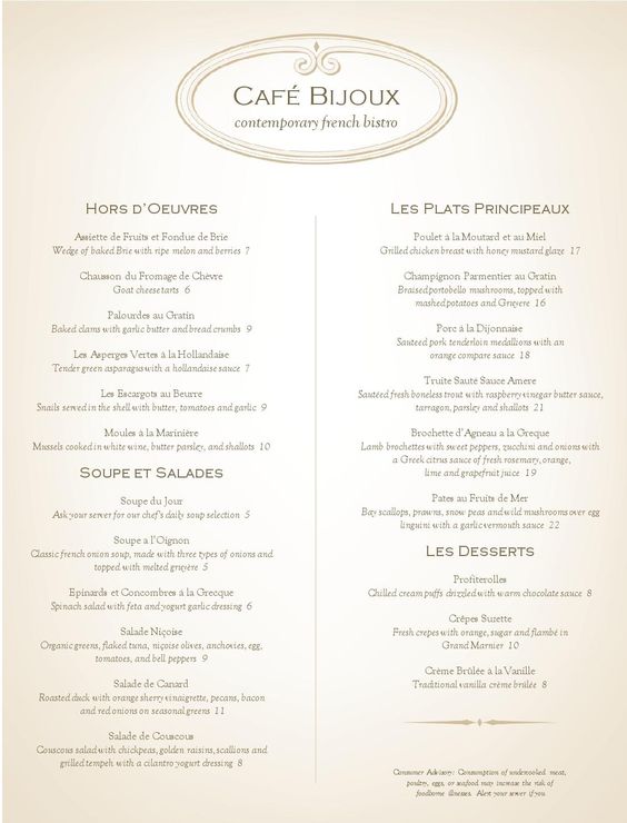
What SaaS marketers can learn from this is to reduce the pain of paying by making the dollar sign less noticeable. Considering the international distribution of most SaaS companies nowadays, it's probably a good practice to use currency code (such as USD) instead of dollar sign symbol.
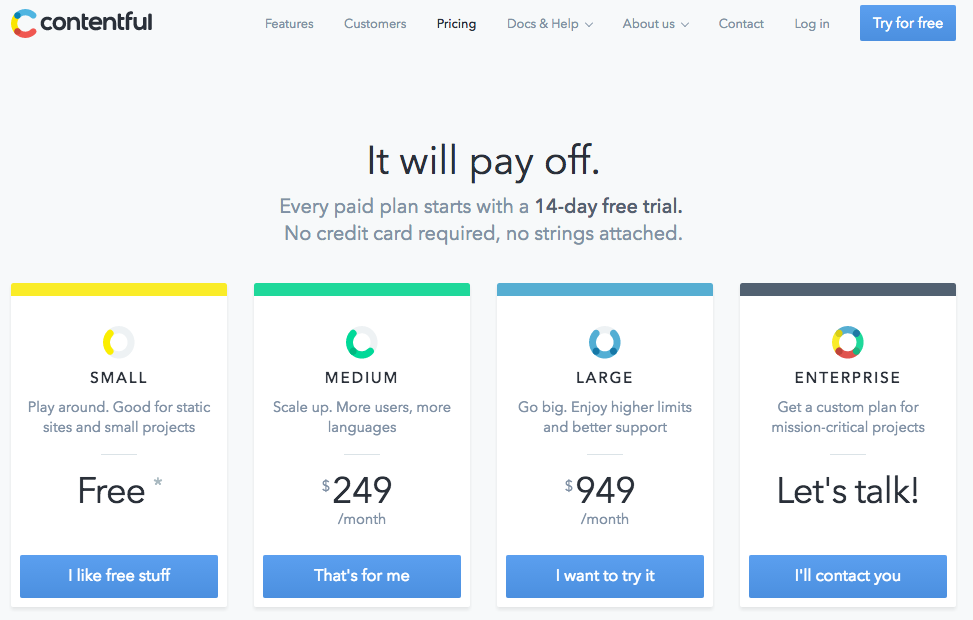
In the example above, Contentful did a great job at highlighting values for user by minimizing the perception of cost – the grey color and small font size made the dollar sign almost imperceptible. While it's not yet a common practice for SaaS products to remove dollar signs, as the competition gets tougher, we can expect to see more and more SaaS companies start doing this as a way to win over consumer preference.
Amplify value by using large numbers
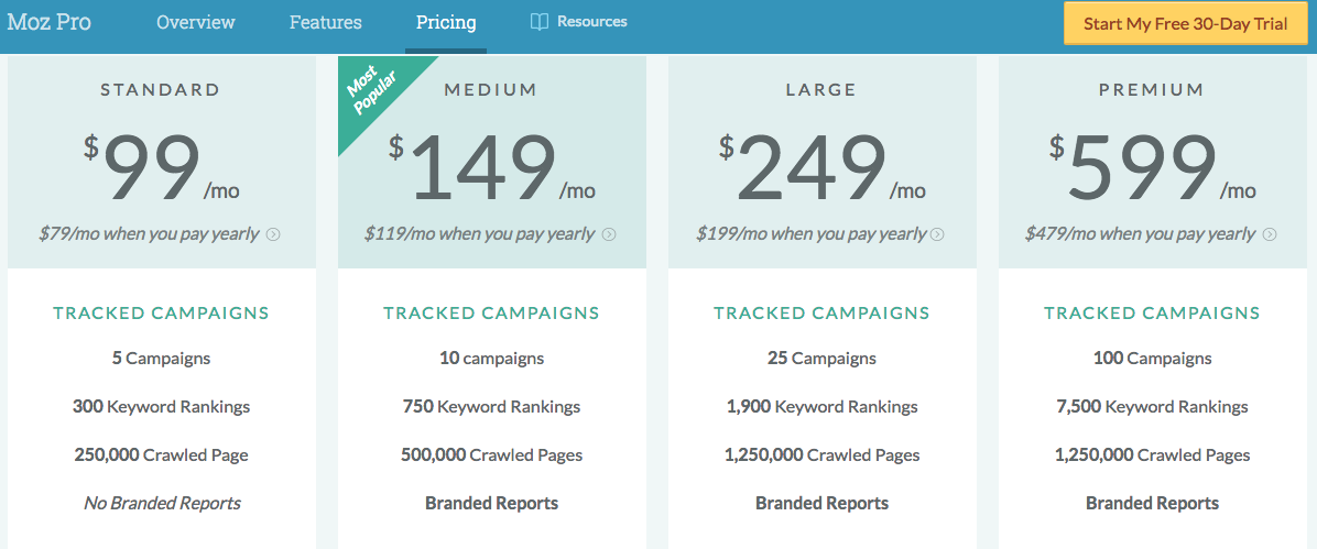
Using price ending in numeral 9 is a common practice in retail. Poundstone dissected 8 studies between 1987 to 2004 and concluded that number 9 is the “magic number” that trumps rounded numbers: an average of 24% sales increase was reported by using charm prices ($49, $79, $1.49 etc).
In this study by MIT and University of Chicago, researchers examined the impact of prices ending in 9 on retail sales. The same standard women's clothing was displayed at price $34, $39 and $44. As you could have guessed, the $39 sold the most, even though $34 is cheaper.
There are many investigations among academics and marketers why these “just under” prices work better yet no conclusion has been drawn. It is speculated that large numbers like 9 communicate value for consumer and better quality. That explains why the MIT study found that prices ending in 9 are less effective when there is a “SALE” sign next to it.
While using 9 in prices still works, Rapp recommends ending with .95 instead of .99, as price ending in 95 may seem “friendlier” to customers.
Use visual cues to highlight the most profitable items
Colorful texts, highlighted boxes, fancy fonts and designs are all gimmicks menu engineers use to direct diners' attention to the most desirable items. Research has shown that users tend not to recall more than one or two highlighted items. Choose what you want to highlight carefully, or your users won't remember anything at all.
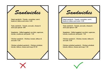
White space is also critically important when it comes to building visual cues. A clustered web page with dense information makes it very hard to read. White space, otherwise known as “negative space”, is the empty space between elements. Research has shown that use of white space can increase comprehension by almost 20%. Space your content generously, and users will find your page easier to read.
Use of color is another effective tactic. According to Eiseman's research in 2000, color “accelerates learning, retention and recall by 55% to 78%”. Use of color also “moves people to action up to 80%”.
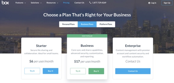
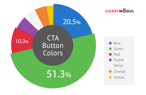
Does color influence purchase decisions? Absolutely. ChartMogul analyzed 40 SaaS pricing pages of companies who have done a LOT of conversion rate optimization, and found out that most used CTA button color is green, followed by blue.
There is no hard and fast rule about which color converts the best. It depends on various factors: the color scheme of your sales page, your product branding, etc. The best practice is to narrow down the colors you want to test for CRO, and run A/B tests to decide on the best one.
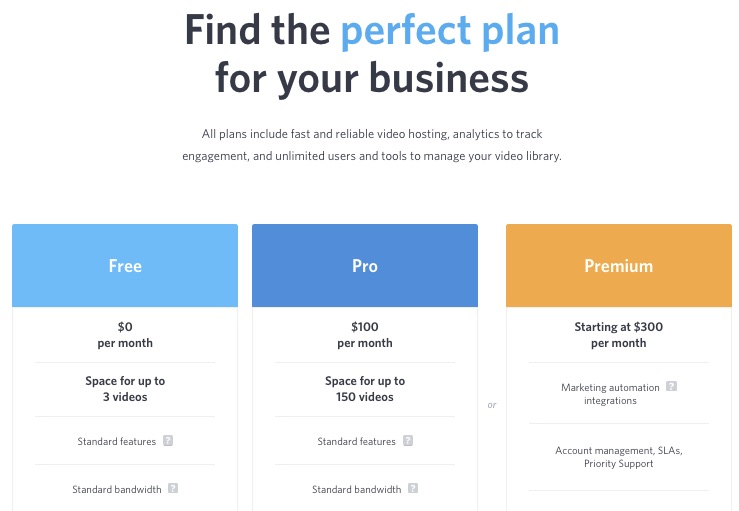
In this example Wistia is using individual colors for each pricing tier to help distinguish between the three options.
Use descriptive language in pricing plans
According to Rapp, a mouth-watering description is another effective strategy to make the food item instantly more desirable. A controlled study done by University of Illinois compared using basic labels such as “chocolate pudding” with descriptive ones such as “Grandma's homemade chocolate pudding”.
The association of flavorful (Grandma) and sweet (chocolate) and smooth (pudding) not only influenced research subjects' purchase (27% increase in sales), but also their post-purchase satisfaction.
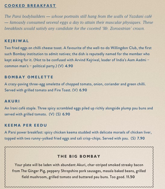
For SaaS marketers, being technically competent is not enough to stand out from competition. Tell a story in your product description – emotional benefits, product origins, customer successes – anything that takes your target buyers on an emotional journey.
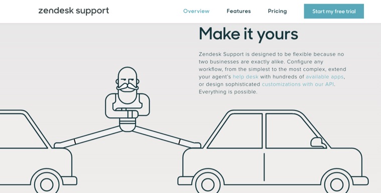
Zendesk does a great job on their product page: they make it all about what the product can support – you, the customer – to be the hero that you needed to be. The feeling of empowerment comes with a compelling statement like “Everything is possible”.
SaaS marketing thought leader Lincoln Murphy has said, “every pricing plan you offer should have a story behind it.”
It's never about features and technologies; what you are selling is a desired outcome and pricing should match the value that comes with achieving said outcome.
Understand your target users' eye movement patterns and cater to it
Scan path by William Doefler in the 1970s is one of the earliest and most cited studies about eye movement patterns. It suggests that menu readers' eyes zigzag across the page like below.
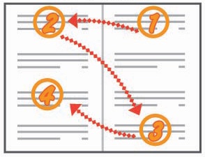
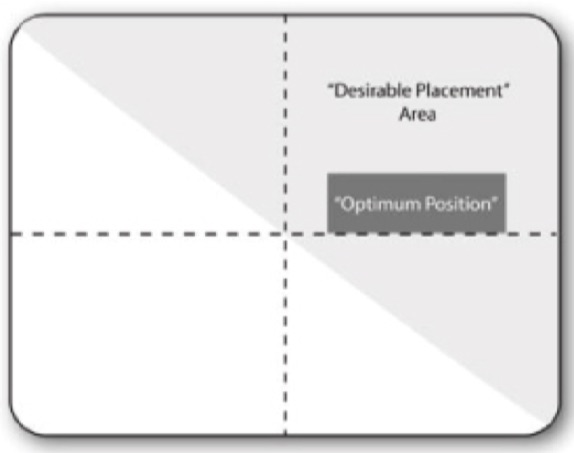
What Doerfler concluded was that the upper-right corner is the “sweet spot” of a two-panel menu where most profitable dish should be displayed.
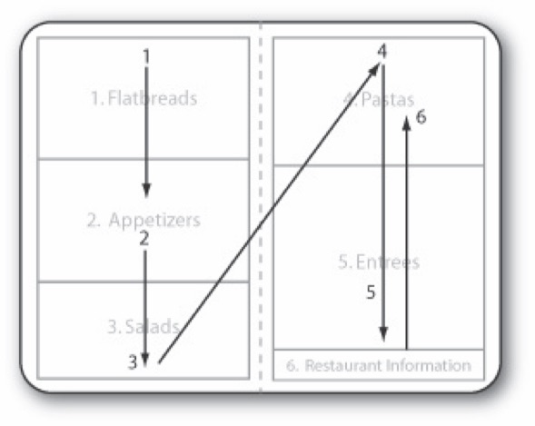
However, recently studies done by SF State University (with a more advanced retinal eye scanner) challenged the validity of menu sweet spot. Their research suggests that readers scan a two-panel menu like a book: from left to right and then down the pages.
Although no “sweet spot” was found in this study, they did discover that readers gave least attention to restaurant information section and salad lists, which they dubbed as “sour spot”.
Rapp still looks to the upper right hand side as the prime real estate of the menu. What today's data-driven SaaS marketers should take away from these studies is not the conclusion, but rather the mindset: study where the “sweet spot” and “sour spot” of your sales page is, and place items strategically.
Heat map and click tracking tools (Crazy Egg and Hotjar are good options) can provide you with insights such as which areas of your page is most clicked on, how much do they scroll, mouse movement etc. This data will empower you to make optimization decisions.
![]()
Leverage the “Decoy Effect” for your desired outcome
According to industry experts, the most expensive item on the menu is mostly used as decoy. It works when you place it next to a less costly item you actually want to sell. The effect of it is that customers will perceive the less expensive one as higher value.
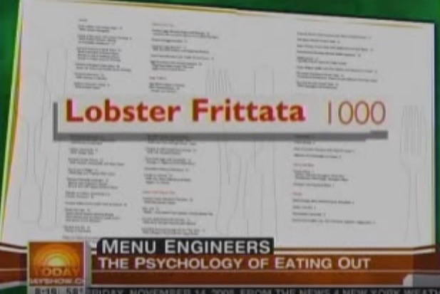
“You probably won't buy it,” says Gregg Rapp in an NBC Today Show interview: “what will happen is that you will find something else a little bit cheaper, and it will look reasonable.”
In the interview, he used a menu that displayed a $20 asparagus right beneath a shockingly pricey $1,000 Lobster Frittata. The $20 asparagus dish became a very good deal compared to the lobster, even though it's overpriced for its own sake.
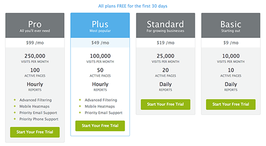
The common practice in SaaS pricing is the 3-tiered high/low/middle pricing table, with the intent to prompting buyers to choose the middle one. But what could be a more intelligent strategy is to insert a fourth “decoy” plan, such as what Crazy Egg did below. By using a expensive “Pro” plan that costs almost twice as much as the most desired “Plus” plan – highlighted in blue box – it makes the “Plus” plan appear as much better value for your bucks.
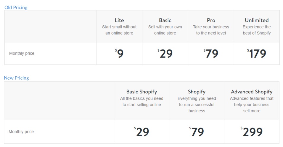
Another success in decoy pricing is Shopify. Back in 2013, their pricing had 4 tiers: Lite, Basic, Pro and Unlimited. Earlier this year, they made a drastic move to their pricing plans: got rid of starter plan (Lite) and dramatically increase highest tier price (from $179 to $299).
Now the price difference between their 2nd and 3rd tier is 67%, which makes the value add in the 3rd tier very attractive, and at the same time retaining a robust mid tier user base (small businesses).
Get your point across – fast
When consumers open a menu, they are immediately overloaded with information. This can trigger analysis paralysis. A well-designed menu takes the guestimation work off of the customer: the less time a consumer has to spend on understanding the choices and deciding to buy, the better the outcome.
Our subconscious brain habitually searches for shortcuts. It's a survival instinct. So instead of reading word for word, most people end up scanning menus. Gallup organization has reported that most consumers spend less than two minutes scanning a menu, and studies by Panitz have shown that 60-70% of sales come from fewer than 18-24 menu items.
Similarly, limit the number of items on your product page. It helps your target buyers when there is less to choose from. Also, rather than listing out every bit of information about your product, only highlight the important bits that will help your customers differentiate value.
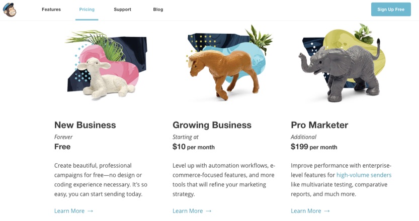
Mailchimp does a great job at eliminating unnecessary information. They got rid of long lists of product feature descriptions like most SaaS companies do, and simply used a one-paragraph description in each plan. It is simple, straightforward, and takes seconds to digest.
Use visual hierarchy in your pricing page to let the most critical information stand out. Research tells us that visual clutter delayed information processing. Group information into different levels. Arrange design elements in clear visual order. This will help your target buyers organize information and make a purchase decision faster.
Conclusion
Cutthroat competition in the food industry has inspired innovative ways to optimize revenue. When we look at the novel ways menu engineers are using consumer psychology insights to reshape the dining experience, SaaS companies pale in comparison.
As consumer SaaS market gets more and more competitive, we hope to see an uptake in adopting innovative pricing strategies such as the ones discussed here.
Is your company struggling with finding the right pricing strategy? Have any of the techniques here worked for your product? Share your thoughts and comments below.
About the Author: Lucia Wang is currently leading Growth Marketing at Visme, a drag-and-drop design tool for everyone. Previously she led growth marketing at Call Levels, an Appster award-winning FinTech app. Prior to her career in tech, she has worked in marketing and communications role at big corporations and media agencies. As a marketer, she is fascinated by persuasion science and consumer behavior.
No comments:
Post a Comment